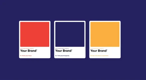
In the vibrant tapestry of brand identity, color plays a pivotal role in shaping perceptions, emotions, and the overall resonance of a brand. The psychology of color in branding goes beyond aesthetics; it taps into the subconscious realm of human perception and emotion, influencing consumer behavior and brand loyalty. This article explores the fascinating interplay between color and consumer psychology, unraveling the impact of different hues on brand identity and consumer perceptions.
Instantaneous Associations
Color is the first aspect of a brand that consumers notice, making it a potent tool for creating instantaneous associations. Different colors evoke specific emotions and connotations, and consumers often form immediate judgments about a brand based on the colors used in its logo, packaging, and marketing materials.
Cultural and Contextual Influences
The psychological impact of color is not universal; it is influenced by cultural and contextual factors. Colors may hold different meanings in various cultures, and their interpretation can be shaped by social, historical, and regional contexts. Successful global brands navigate this complexity by carefully considering cultural nuances in their color choices.
Warm vs. Cool Tones
The color palette chosen by a brand contributes to the emotional resonance it elicits. Warm tones, such as reds and oranges, often evoke feelings of energy, passion, and warmth. On the other hand, cool tones, like blues and greens, are associated with calmness, trust, and reliability. Brands strategically select colors to align with the emotional tone they wish to convey.
Brand Personality Traits
Colors become an integral part of a brand’s personality. For example, a brand seeking to portray innovation and modernity might opt for sleek and bold colors like metallics or tech-inspired blues. Meanwhile, a brand emphasizing eco-friendliness and sustainability may choose earthy greens and browns to convey a natural and organic persona.
Color Consistency Across Channels
Establishing a consistent color scheme across various brand touchpoints is crucial for brand recognition. Whether on a website, social media, or packaging, maintaining a harmonious color palette reinforces visual consistency. This consistency not only enhances brand recall but also fosters a cohesive and professional brand image.
Subtle Variations for Diverse Offerings
While maintaining consistency is key, brands with diverse product or service offerings may introduce subtle variations in color schemes. This allows for differentiation between product lines while still preserving the overall brand identity. The art lies in striking the right balance between uniformity and diversity.
Influence on Purchasing Decisions
The psychology of color extends to consumer decision-making. Studies indicate that color can influence purchasing decisions, with different hues evoking specific responses. For instance, impulse buys may be triggered by vibrant and bold colors, while muted and sophisticated tones might appeal to consumers seeking luxury or sophistication.
Call-to-Action Elements
Colors are strategically employed in call-to-action (CTA) elements to prompt specific responses. The color of a “Buy Now” button or a promotional offer can influence the likelihood of engagement. Red, for example, is often associated with urgency and can be effective for encouraging immediate action.
Understanding Cultural Symbolism
Brands operating in diverse cultural landscapes must be attuned to the cultural symbolism of colors. Red, which symbolizes luck and prosperity in some Asian cultures, might connote danger or excitement in Western contexts. Brands that navigate these cultural nuances effectively demonstrate cultural intelligence and avoid unintended misinterpretations.
Adapting to Local Preferences
Global brands often adapt their color strategies to align with local preferences. For instance, a brand associated with youthful energy in one region might choose different colors to convey a sense of sophistication or tradition in another. Adapting to local color preferences enhances relatability and cultural resonance.
Breaking Stereotypes
Traditionally, certain colors have been stereotypically associated with gender. Pink, for example, has been linked with femininity, while blue is associated with masculinity. However, contemporary branding challenges these stereotypes, with many brands intentionally breaking away from traditional gender color norms to appeal to diverse audiences and promote inclusivity.
Gender-Neutral Color Choices
Brands embracing gender neutrality may opt for gender-neutral color palettes, avoiding traditional associations. This approach not only aligns with evolving societal norms but also positions the brand as progressive and inclusive. Gender-neutral color choices reflect a brand’s commitment to diversity and resonate with a broader audience.
Trustworthiness and Reliability
Certain colors are inherently associated with trustworthiness and reliability. Blues, in particular, convey a sense of stability and dependability. Brands in finance, technology, and healthcare often leverage blue to instill confidence and trust among consumers. The choice of color becomes a non-verbal cue signaling the brand’s commitment to integrity.
Authenticity and Transparency
The authenticity of a brand is intricately linked to its color choices. Brands that align their colors with their values and messaging project transparency and authenticity. When the visual elements harmonize with the brand’s narrative, consumers are more likely to trust the brand and form a positive emotional connection.
Staying Relevant with Trends
The psychology of color is not static; it evolves with societal trends and cultural shifts. Successful brands stay attuned to current design trends and adapt their color palettes accordingly. This adaptability ensures that the brand remains visually relevant and resonates with contemporary consumer preferences.
Refreshing Without Losing Identity
Refreshing a brand’s color palette doesn’t necessarily mean a complete overhaul. Brands can introduce subtle changes or incorporate accent colors to stay fresh while retaining core elements. This balance allows for visual evolution without risking the loss of brand recognition.
Conclusion
The psychology of color in branding is a captivating exploration of the interplay between visual aesthetics and human emotion. Successful brands recognize the power of color to shape perceptions, trigger emotions, and influence consumer behavior. By understanding the cultural, emotional, and psychological dimensions of color, brands can strategically leverage this art form to craft a compelling and resonant brand identity. From establishing trust to prompting consumer action, the strategic use of color emerges as a powerful tool in the arsenal of brand builders, weaving a visual narrative that leaves a lasting imprint on the consumer psyche.


